Where fun lives large.
Navy Pier partnered with us to translate the brand idea of “Where Fun Lives Large” into a fresh logo design. This was part of a broader rebrand initiative to evolve Navy Pier from a historical landmark to a vibrant destination for locals and tourists alike.
BRAND REDESIGN
DESIGN LEAD: SRIPRIYA PRASAD
CREATIVE DIRECTOR: DAVID GARDNER
PROJECT MANAGER: MICHAEL MIRZA
Reinventing a Chicago icon.
Our challenge was to dramatically reinvent the pier’s logo and visual design system while preserving its unique history and spirit. And in doing so, send a signal to the world to take a fresh look at the lakefront treasure as it embarks upon its next 100 years.
The new mark embodies the pier’s essence – its rich history, newly designed spaces, ferris wheel, and spirit of fun – aimed to bring a smile to the millions of people who encounter it each year. The visual identity system is designed to perform across hundreds of touchpoints throughout the half-mile-long pier as well as across its digital presence.
A full exploration from sketch to render.
We executed our creative process in three stages:
We worked very closely with Navy Pier’s marketing department, getting their buy-in at every level from the Marketing Department to the C-Level suite and coordinating field surveys with the public during the final concept phases.
A peerless source of inspiration.
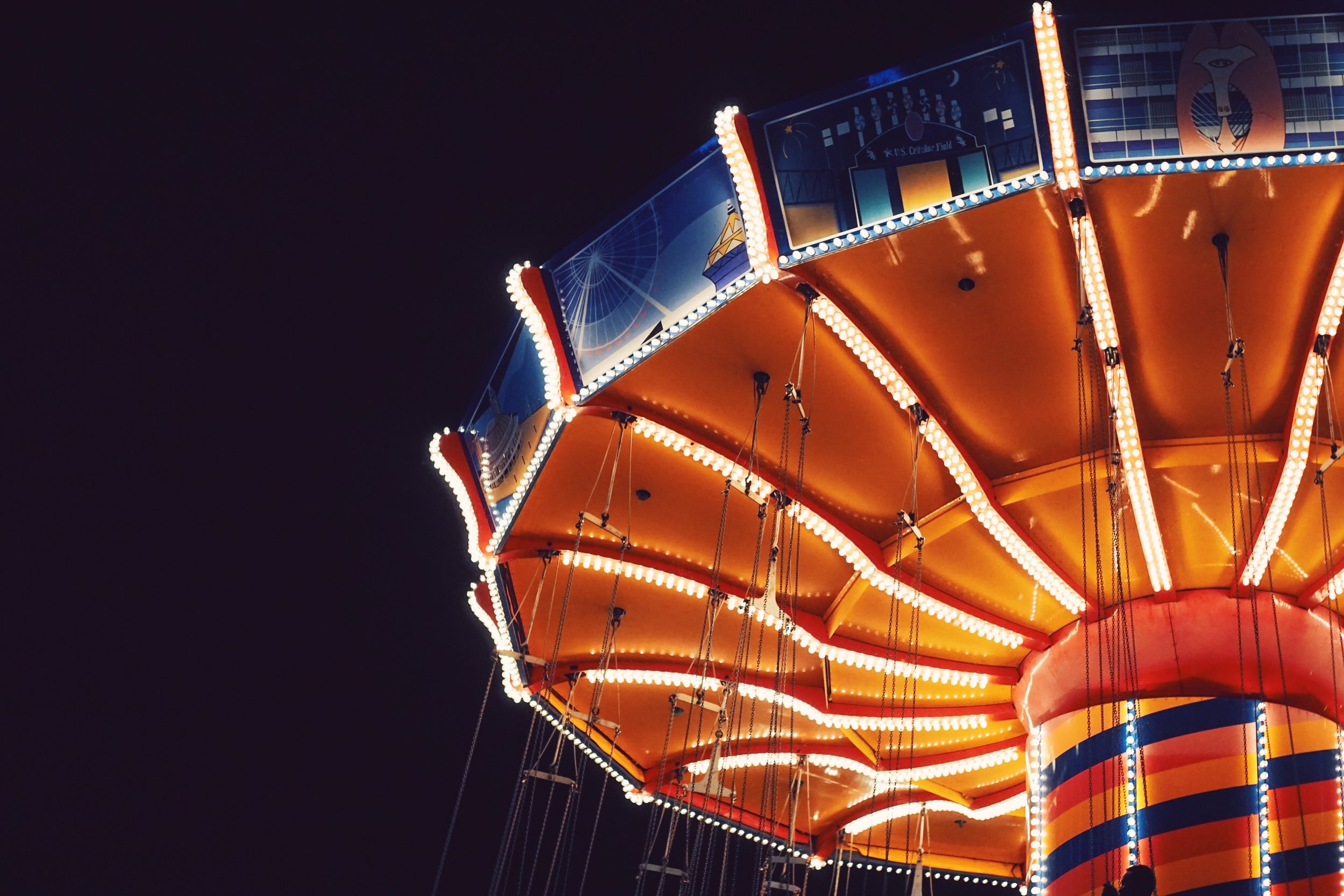
The brand’s vibrant, brilliant palette was sampled directly from the Pier’s familiar sights — from Lake Michigan to the carousel. We also selected Mr Eaves based on its similarity to historical signage and its expansive range of voices, from refined to bold.
By drawing from this inspiration, we’re linking Navy Pier’s foundational history and present brilliance to its bright future.


