Train Like A Baller
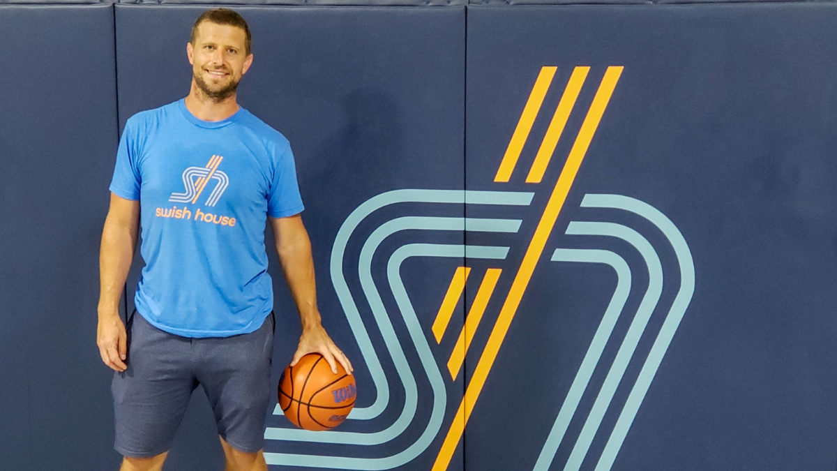
Formerly Hoopslink, Swish House is a high-intensity workout created by former pro and college players, focusing on team shooting contests, individual skills and other hoops-theme exercises.
Swish House was looking to expand their community of players beyond Chicago, and needed an updated brand identity to match.
BRAND REDESIGN
DESIGN LEAD: SRIPRIYA PRASAD
CREATIVE DIRECTOR: DAVID GARDNER


Getting our head in the game.
The brand needed to appeal to a diverse customer base — intense enough for serious professionals, while approachable enough for more casual players.
Swish House also wanted to move away from literal basketballs in the mark and explore more subtle references back to the sport — we iterated on a number of logotypes, monograms, and abstract symbols to find the balance between power and fun.
Contemporary momentum teams up with old-school cool.
The SH monogram’s forward-right slant is interwoven with the upward vertical bars, adding speed, verve, and intensity to the mark. The stacked lines in the monogram recall retro basketball team logos, such as the Portland Trail Blazers, and lowercase wordmark keeps things feeling friendly and contemporary.
The brand color palette pairs vibrant orange with cool slate, balancing energy and structure. Bright secondary colors round out the rest, bringing in fun, energetic pops.
Teamwork makes the dream work.
We worked closely with the client throughout the creative process, from sketch to final renders. We also designed Swish House’s new website on Squarespace with MindBody integration — check out swishhouse.com to learn more about their mission and sign up for a class.
With the launch of the new identity and site in 2019, Swish House successfully expanded their program from Chicago to Traverse City and Grand Rapids, and is currently looking to add more locations across the country.


